Coding Workshop 2 - How Much App Part 1

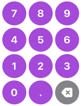
Entry Buttons
For the How Much app we want to enter the value of a restaurant bill, the tip percentage and the number of people so that we can calculate each individual's portion. Your users will do this by tapping on buttons that will represent the numbers fro 0 through 9 and the decimal point.
Let's start by creating the shape that we can use for our button. I like to prototype right in a SwiftUI view
Start by replacing the
VStackand padding withButtonwith a label of "7"Button("7") {}Buttons, like other views in SwiftUI can be stylized by applying a wide range of modifiers
Apply
.font(.largeTitle)Apply
.bold()Apply .
background(.purple)Apply
.frame(width: 80, height: 80)Reverse frame and background as you will see they are in the wrong order
Order matters when applying modifiers to views that will change the size.
Apply
.foregroundColor(.white)Apply
.clipShape(Circle())Button("7") {}.font(.largeTitle).bold().frame(width: 80, height: 80).background(.purple).foregroundColor(.white).clipShape(Circle())

This looks pretty good, except when you tap on the button, only the text view fades.
I want the entire button to react when I tap on it
Why? Because the action visual only affect the label and it is that single string "7".
This requires a different button constructor. With this constructor the action comes in the first closure and the second one is a
labelfor which we can apply any type ofViewthat we like. So the same original button as in step 1 can be written like this:Button {} label: {Text("7")}Now apply those same modifiers to the
TextviewButton {} label: {Text("7").font(.largeTitle).bold().frame(width: 80, height: 80).background(.purple).foregroundColor(.white).clipShape(Circle())}
HStack
We can stack 3 buttons horizontally by embedding within an HStack and just change the text string for each one. So we can change our text views to represent the buttons for 7, 8 and 9.
HStack {    Button {
    } label: {        Text("7")            .font(.largeTitle)            .bold()            .frame(width: 80, height: 80)            .background(.purple)            .foregroundColor(.white)            .clipShape(Circle())    }    Button {
    } label: {        Text("8")            .font(.largeTitle)            .bold()            .frame(width: 80, height: 80)            .background(.purple)            .foregroundColor(.white)            .clipShape(Circle())    }    Button {
    } label: {        Text("9")            .font(.largeTitle)            .bold()            .frame(width: 80, height: 80)            .background(.purple)            .foregroundColor(.white)            .clipShape(Circle())    }}
Create a function that returns a view to reduce redundant code
This is repeating code so why not create a function that will allow us to passing in some string to be used as the text view that will return some View that handles the creation of the button along with all of the modifiers.
This function will have one parameter and we can use the label number, but it will be a String and it will return some View
Create the function outside the body, after the last brace but BEFORE the end of the view struct
func numberButton(number: String) -> some View { Button { } label: { Text(number) .font(.largeTitle) .bold() .frame(width: 80, height: 80) .background(.purple) .foregroundColor(.white) .clipShape(Circle()) }}With that function created, we can replace the contents of the HStack with 3 calls to that function passing in a different string value for a number each time.
HStack { numberButton(number: "7") numberButton(number: "8") numberButton(number: "9")}We can do better with a ForEach loop
ForEach loop on a range of numbers
ForEach loops will iterate over a range of items so long as the items are unique and will provide you with an iterator.
We need to specify, by way of the id argument, what is the thing that is unique about the range. In this simple case, you can use the keyPath \.self and this is followed by a pair of braces where you specify the iterator name number and we want to use it in the following code.
ForEach(7...0, id: \.self) { number in }Then we can replace all 3 of the numberButton function calls with a single one and use string interpolation to convert the integer number to a string by enclosing it in \() so \(number)
xxxxxxxxxxHStack { ForEach(7...9, id: \.self) { number in numberButton(number: "\(number)") }}VStack
We can stack 3 HStacks vertically within a VStack and simply alter the range to reflect the range of the 3 buttons in each row; 7...9, 4...6 and 1...3,
The last button in the 4th row is different so we will have to do something else for it
xxxxxxxxxxVStack { HStack { ForEach(7...9, id: \.self) { number in numberButton(number: "\(number)") } } HStack { ForEach(4...6, id: \.self) { number in numberButton(number: "\(number)") } } HStack { ForEach(1...3, id: \.self) { number in numberButton(number: "\(number)") } }}For the 4th Row, we can add another HStack.
The first two buttons are easy, they are the same as a number button in style with the first button being a "0" label and the second one a "."
xxxxxxxxxxHStack { numberButton(number: "0") numberButton(number: ".")}For the last button in the row, the delete button, we can't use a number button because our action is going to be different.. In addition, the label is an image and it is an SFSymbol image that is delete.backward.fill, So we can create a Button and use an SFSymbol for the label.
xxxxxxxxxxButton {
} label: {    Image(systemName: "delete.backward.fill")}
The styling is almost identical, the only difference is the background color.
It turns out that Images composed from SFSymbols can be styled the same way as a Text view so we can use that same styling as for our number button, and just change the color for the background to .gray
xxxxxxxxxx.font(.largeTitle).bold().frame(width: 80, height: 80).background(.gray).foregroundColor(.white).clipShape(Circle())This completes the Entry buttons layout
The Options Picker buttons
Below the button entry fields are the two options. The tip percentage we want to apply and the number of people in our party.
We will create a Picker that will allow us to update a special type of variable with whatever value we choose
The Tip Picker
Pickers must be bound to some kind of special variable that can be updated. However, normal variables in structs are immutable, which means that they cannot change. That is, unless we decorate them with property wrapper that is @State
At the top of the struct, above the body variable create a new variable called tipPct and initialize it by assigning it a value of 0 and decorate it with the @State property wrapper.
Swift has what is type inference. Since we assign
0to our variable on initialization, it will infer that this is an Integer
xxxxxxxxxx@State private var tipPct = 0After the last HStack, create a picker by dragging it out of the library and change the select from .constant(1) to $tipPct and this will bind it to that variable
Change the label to Text("Tip")
Instead of the two sample Text views provided from the library, we can use another ForEach loop like we did before to specify the range that we want to allow for tips. Say 0...100.
For each of the choices we want to display the iterated tip (which is an Int so to display it as a string, we need to use string interpolation again) and then after that, we can append a % symbol so that it will display something like 18%.
xxxxxxxxxxPicker(selection: $tipPct, label: Text("Tip")) { ForEach(0...100, id: \.self) { tip in Text("\(tip)%") }}A picker can accept any kind of styling that a button can and there is a special modifier called a buttonStyle
I am going to apply the .bordered buttonStyle to the picker
xxxxxxxxxx.buttonStyle(.bordered)Notice that the label is not displayed. This is displayed only if we present this picker in a Form. So we will need to provide our uses with another clue as to what this is.
Embed the Picker and it's style in an HStack and add a Text view as the first view using the same string "Tip"
xxxxxxxxxxHStack { Text("Tip") Picker(selection: $tipPct, label: Text("Tip")) { ForEach(0...100,id: \.self) { tip in Text("\(tip)%") } } .buttonStyle(.bordered)}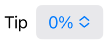
The NumPeople Picker
Below this, we want another picker for the number of people so this will require another @State property that we can default to the integer value 1.
xxxxxxxxxx@State private var numPeople = 1Then we can copy and paste the previous HStack and adjust to represent our number of people picker. Let's limit to a range of 1 to 20.
xxxxxxxxxxHStack { Text("Number of people") Picker(selection: $numPeople, label: Text("Number of People")) { ForEach(1...20,id: \.self) { numPeople in Text("\(numPeople)").tag(numPeople) } } .buttonStyle(.bordered)}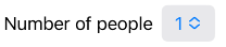
Below that, we want to create two buttons, side by side that we can display in an HStack. These can be simple string based labels to represent Calculate and Clear.
xxxxxxxxxxHStack { Button("Calculate") { } Button("Clear") { }}We can also apply a .borderedProminent button style to the HStack and it will get applied to all buttons in the HStack container.
xxxxxxxxxx.buttonStyle(.borderedProminent)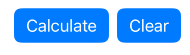
Total View
Above the number pad, we want to create a Text view that will display the amount that our bill is as we enter it. As this will change when we add each new digit, we need to keep track of that in another @State variable. And we want our amount aligned to the right.
So create a string property for that
xxxxxxxxxx@State private var total = "0"Then as the first entry in the VStack, above the HStack, create a Text view using that total string. No need to use string interpolation here because it is already a string.
xxxxxxxxxxText(total)Apply Style
This time I am going to choose a larger font than what SwiftUI provides so we can specify a size of 70 by choosing the .system case for the font argument.
Then, to align it to the right, we specify a frame with a specific width, which is 3 X 80 (the width of each button) + 2 X 10 (the spacing between each) = 260 and provide the alignment of .trailing.
And finally we can apply a vertical padding to override the default in the VStack to specify it as 1
xxxxxxxxxx.font(.system(size: 70)).frame(width: 260, alignment: .trailing).padding(.vertical,1)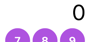
NavigationStack
On Last thing. We are not doing any Navigation, but we can add a title to our view by embedding our entire VStack inside another container called a NavigationStack
xxxxxxxxxxNavigationStack { }Then we can apply to the view INSIDE the NavigationStack another modifier that is called .navigationTitle and provide the string "Portion Calculator"
xxxxxxxxxx.navigationTitle("Portion Calculator")I wold like to do one more thing and that is to push the entire contents of this VStack up to the top. I can do this by adding a Spacer() view as the last view in the VStack. A Spacer will take up all of the space available so it will push up down and out to the sides thus pushing the contents of the VStack up to the top.
xxxxxxxxxxSpacer()That completes our UI. Next we have to code the actions in our buttons
Button Tint and @Main
I don't like the blue tint of our buttons, or the pickers, so I would like to change that. I can do that individually, or I can apply it to the entire view for example I can apply to the NavigationStack this .tint modifier and specify a color of .purple.
xxxxxxxxxx.tint(.purple)This is not necessarily the best place for this however since there may be multiple views in our application and I do not want to have to do this each time.
When our app launches, the first file it sees is the one marked with the @Main property wrapper How_MuchApp.swift.
You can see in there that the WindowGroup presents ContentView as our first view so we can apply the tint there and it should carry through to the view.
xxxxxxxxxx@mainstruct How_MuchApp: App { var body: some Scene { WindowGroup { ContentView() .tint(.purple) } }}If I switch back to ContentView now, it doesn't. Or does it. Run the app in the simulator and you will see that it does.
Why?
It is because the canvas preview has NO IDEA what it took to get there. This is just a preview presentation of this code in the editor and has no idea that it came from the app entry point.
If you want to see what it looks like in the preview, then we have to apply all modifications to ContentView that we did in the app Entry point
xxxxxxxxxxstruct ContentView_Previews: PreviewProvider { static var previews: some View { ContentView() .tint(.purple) }}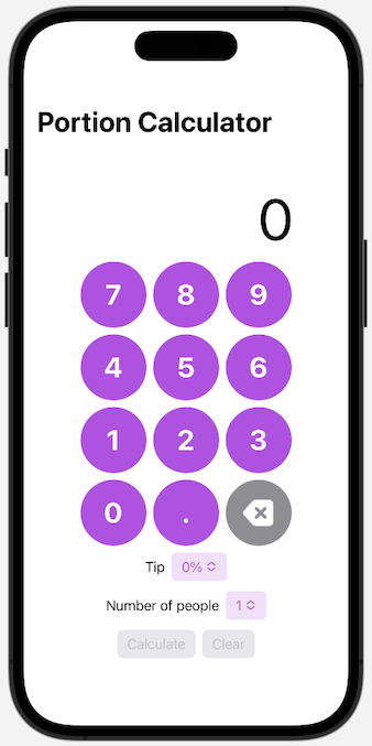
Completed Code for ContentView
xxxxxxxxxxstruct ContentView: View {    @State private var tipPct = 0    @State private var numPeople = 1    @State private var total = "0"    var body: some View {        NavigationStack {            VStack {                Text(total)                    .font(.system(size: 70))                    .frame(width: 260, alignment: .trailing)                    .padding(.vertical,1)                HStack {                    ForEach(7...9, id: \.self) { number in                        numberButton(number: "\(number)")                    }                }                HStack {                    ForEach(4...6, id: \.self) { number in                        numberButton(number: "\(number)")                    }                }                HStack {                    ForEach(1...3, id: \.self) { number in                        numberButton(number: "\(number)")                    }                }                HStack {                    numberButton(number: "0")                    numberButton(number: ".")                    Button {
                    } label: {                        Image(systemName: "delete.backward.fill")                            .font(.largeTitle)                            .bold()                            .frame(width: 80, height: 80)                            .background(.gray)                            .foregroundColor(.white)                            .clipShape(Circle())                    }                }                HStack {                    Text("Tip")                    Picker(selection: $tipPct, label: Text("Tip")) {                        ForEach(0...100,id: \.self) { tip in                            Text("\(tip)%")                        }                    }                    .buttonStyle(.bordered)                }                HStack {                    Text("Number of people")                    Picker(selection: $numPeople, label: Text("Number of People")) {                        ForEach(1...20,id: \.self) { numPeople in                            Text("\(numPeople)").tag(numPeople)                        }                    }                    .buttonStyle(.bordered)                }                HStack {                  Button("Calculate") {                                      }                  Button("Clear") {                                      }                }                .buttonStyle(.borderedProminent)              Spacer()            }            .navigationTitle("Portion Calculator")        }    }        func numberButton(number: String) -> some View {        Button {                    } label: {            Text(number)                .font(.largeTitle)                .bold()                .frame(width: 80, height: 80)                .background(.purple)                .foregroundColor(.white)                .clipShape(Circle())        }    }}
struct ContentView_Previews: PreviewProvider {    static var previews: some View {        ContentView()            .tint(.purple)    }}